Here are the assignments and examples of the more successful outcomes from my students. Each project was preceded by several exercises and readings covering principles of visual organization, color, and meaning.
Project 1: Book Cover
Description: Create three (3) distinctly different designs of a book cover. Your design must show an understanding of the visual organization principles you have studied in class: unity, emphasis, balance, rhythm, and depth. See full project description here.
Student Research
Student Research
Student Designs
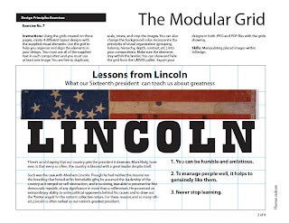
Grid Exercise: Lincoln Poster
Instructions: Using the grids created on these pages, create 4 different layout designs with the supplied visual elements. Use the grid to help you organize and align the elements in your design. You must use all of the supplied text in each composition and you must use at least one image. You are free to duplicate, scale, rotate, and crop the images. You can also change the background color. Incorporate the principles of visual organization (grouping, balance, hierarchy, depth, contrast, etc.) into your compositions. Make sure the elements stay within the border. You can show and hide the grid from the LAYERS pallet. Export your designs in both JPEG and PDF files with the grids showing.
Project 2: Creative Inspiration Poster
Description: You will design a 11" X 17" informational poster that features a person or entity within the creative industry who's work your admire. This can be a designer, artist, illustrator, animator, studio, company, etc. Your poster must include a title or name, bio (at least one paragraph), and examples of their work. You can also include portraits, photos, quotes, or anything that ads to the understanding of their personality and/or work. See full project description here.Your design must show an understanding of the visual organization principles you have studied in class up to this point: modular grid system, unity, emphasis, balance, rhythm, and depth.
Project 3: iPad Welcome Screen
Description: You will design five (5) welcome pages for an online commerce company that are specially formatted for display on the new Apple iPad. Your design must show an understanding of the visual organization principles you have studied in class for the whole semester: modular grid system, unity, emphasis, balance, rhythm, depth, and color theory. Each of the pages must convey a different emotion or concept with color. Each of the pages must have a grid system that helps you organize at least 6-9 products that the company is promoting. Each of the pages must show your understanding of the principles of visual organization. See full project description here. 


.jpg)


