Wednesday, January 27, 2010

Balance, Symmetry and Asymmetry

BalanceThe distribution of weight or force within a composition.

The examples that demonstrate these principles were designed by Paul Rand, considered to be the father of modern design. Check out his work at www.paul-rand.com.


Weight and Gravity
Visual Weight
The inclination of shapes or forms to float or sink within a composition. Also refers to the relative importance of a visual element in a design.


Compositional forces that have the most influence on a design:
  • Size - larger = heavier
  • Value - darker = heavier
  • Type of Shape - simple = heavier, complex =lighter
  • Texture - more coarse = heavier
  • Location - lower = heavier
  • Orientation - straight = stable, angled = unstable or moving
Visual Center
Just above the mathematical center of a page. Objects tend to be more comfortably stable to the viewer in this area.
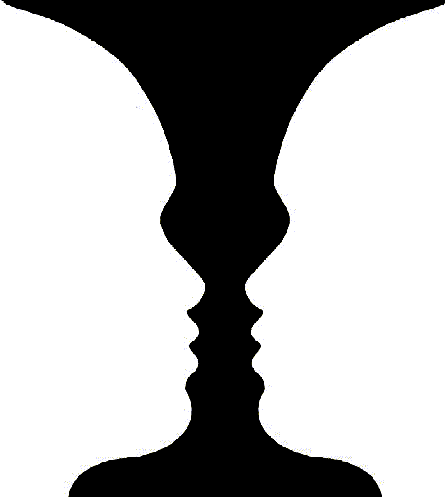


Symmetrical Balance
Approximate Symmetry
Also known as Bilateral Symmetry, is when similar imagery appears on both sides of a central axis.


Other forms of Symmetry
Radial or Rotational Symmetry
Lines and images are mirrored both vertically and horizontally with the center of the composition acting as the focal point.


Dilational Symmetry
Similar to radial symmetry but the elements increase or decrease in spiraling line. Dilational symmetry can be used to emphasize depth or distance.


Translational Symmetry
Continuous, invariant repetition of a visual element.


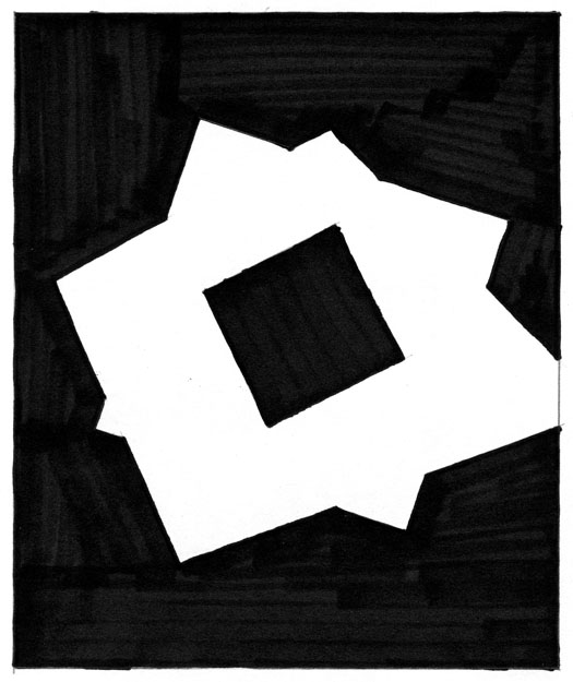
Asymmetrical Balance

Creation of equilibrium among elements with different visual characteristics that do not mirror each other on a central axis.


Depending on the degree of asymmetry, the composition can be stable, dynamic, or chaotic.


Monday, January 25, 2010

Shape, Emphasis and Heirarchy

Shape
A flat enclosed area that is created by:
  • Enclosing an area with a continuous line
  • Surrounding an area with other shapes
  • Filling an area with solid color or texture
  • Filling an area with broken color or texture

Types of Shape
  • Positive and negative space figure-ground (see last lecturer from last week)
  •  Rectilinear (straight lines and angles) and Curvilinear (curves, flowing edges)
  • Geometric (hard, precise edges, mathematical in their structure) and Organic (commonly found in nature--leaf, plant, water, etc.)

  Degrees of Representation
  • Non-objective Shapes - circles, rectangles, squares  "Pure forms"
  • Representational Shapes - Derived from specific subject matter and strongly based on direct observation
  • Abstract Shapes - Derived from visual reality,  but are distilled and transformed from the  resemblance of their original source.

Degrees of Definition
Definition is the degree to which a shape is distinguished from both the background and the positive shapes within the design.
  • High Definition - Creates a strong contrast between shape and background. Increased clarity and immediacy of communication
  • Low Definition - Soft-edged shapes, gradations, transparencies, etc. Increase complexity and encourages multiple interpretations


Emphasis
Emphasis gives prominence to a specific area or part of a design. A focal point is a compositional devise that is used to create emphasis.
 

Emphasis by Isolation
An anomaly is a break from the norm.  Since we tend to connect verbal and visual information to make meaning, an object that breaks from the group tends to attract our attention. 


Emphasis by Placement
Since every part of a composition has a distinctive power, placement alone can increase the emphasis of an object. 


Emphasis Through Contrast
Contrast is created when two or more forces operate in opposition. When using the 80/20 rule, contrast can be very effective. The larger force sets the standard and the smaller force creates the exception. Depending on how a composition is structured, the smaller force can have the emphasis.
When creating a composition, consider the following to create emphasis:
  • Contrast in Scale
  • Contrast in Shape
  • Contrast in Color

Hierarchy
A hierarchy is an organization of items into different levels of relative importance. Through basic design principles you emphasize one element over another so more important content looks more important.  


Visual hierarchy makes clear the primary, secondary, and supporting elements on the page.
These levels are also called Dominant, Sub-dominant, and Subordinate.

Wednesday, January 20, 2010

Unity


Unity: Similarity, oneness, togetherness, cohesion
Variety: Difference


In their extremes:
Unity = Sameness/Boring/Predictable/Stable
Variety = Chaos/Confusion/Instability/Noise


 http://s3.amazonaws.com/adaptiveblue_img/topics/p/gestalt_psychology


Both Unity and Variety are needed to create interesting compositions.


Gestalt Psychology: ("essence or shape of an entity's complete form")

"form-forming capability of our senses, particularly with respect to the visual recognition of figures and whole forms instead of just a collection of simple lines and curves."

"The whole is greater than the sum of the parts"

Gestalt Psychology defined principles in how we organize and understand our world
These principles are used in creating effective design.


"When presented with a collection of separate visual units, we immediately try to create order and make connections." This process is called Grouping.


Principles of Grouping

Proximity
Proximity occurs when elements are placed close together. They tend to be perceived as a group.


Similarity
Similarity occurs when objects look similar to one another. People often perceive them as a group or pattern.


Containment
A shape or area that surrounds other visual elements will make them appear as a group.
http://enworb.net/gates/School/ART%20112/20090826%20-%2001%20Gestalt%2010.jpg


Repetition
Repetition occurs when the same visual element is repeated multiple time, making them appear as a group.


 Image: Maxialfaro | Dreamstime


Continuity
Continuation occurs when the eye is compelled to move through one object and continue to another object. 


fig01.gif


 fig02.gif


Closure
Closure occurs when an object is incomplete or a space is not completely enclosed. If enough of the shape is indicated, people perceive the whole by filling in the missing information.


Pattern
Similar visual objects that are placed in a consistent manner will appear as a group.


 http://patternsofreflection.com/wp-content/uploads/2008/08/8n.gif 


[400_F_1829122_NbBL01YhDWghM1234wblHa6FuvRFu4.jpg]


Grid
A Grid is created through intersecting lines. A grid can also be implied by the alignment of objects within a composition. Designers can use grids to organize visual elements.

 http://www.acrstudio.com/teaching/dmdesign4/images/wk03logos/pictogram_grid.gif


 http://madebysix.files.wordpress.com/2008/12/thegridsystem.jpg
 {title}


 http://www.swisslegacy.com/wp-content/uploads//ea.jpg
 http://devkick.com/blog/i/europe/wohnbadarf.jpg


Ground Relationship
The eye differentiates an object form its surrounding area. a form, silhouette, or shape is naturrally perceived as figure (object), while the surrounding area is perceived as ground (background).

Balancing figure and ground can make the perceived image more clear. 

Using unusual figure/ground relationships can add interest and sublety to an image.


 http://www.cres.org/star/RubinGestalt.gif