I'll label one principle used in the example, but see if you can pick out other principles employed by the designer.
The content of these examples relate to the Bauhaus, a school in Germany from 1919-1933 that has had a profound influence on modern design, art, architecture, and photography.

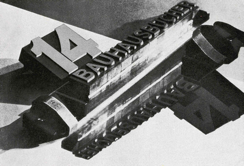
Contrast in Size
Designer: Muriel Cooper, 196

Contrast in placement


Contrast in color
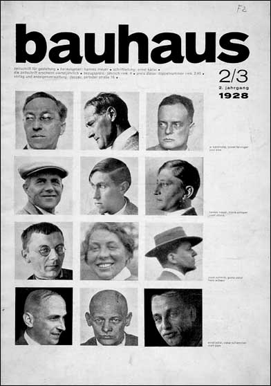
Designer: Herbert Bayer

Designer: Herbert Bayer
Contrast in size
Moholy-Nagy 1929

No comments:
Post a Comment